Thursday, 10 December 2009

100days of Art: Day Eight - Mistakes and Expectations


Marc Quinn - Stuart Penn (2000)

Art Historians make mistakes. It goes with the territory, paintings like The Massacre of the Innocents get attributed to the wrong artist, new evidence comes to light and completely turns received wisdom about a sculpture on its head; it all part and parcel of dealing with a subject that attempts to knit together a coherent story out of a mass of uncertainties, contradictions and, on occasions, downright lies. (The dates that Kasmir Malevich inscribed on his Black Square paintings being an example of the latter – though to be fair he was as mad as a bag of badgers in a spin dryer.)

Since the discipline took lessons from the likes of Foucault and Barthes and developed doubt into a valid ideological position, negotiating the potholes and chicanes of art history is slightly easier – in the first year of study, the student art historian learns the magic word ‘problematic’, a useful means of tying up the flailing loose ends of a tricky paper. You can even use it as a verb, “This is of course problematicised by…” It’s a cop out really, but a necessary one, without it you’d never finish an essay.

Sometimes the repercussions of these mistakes only affect the rarefied circle of art history itself, tiny ripples in a small pond, a few papers may have to be re-written, some textbooks and monographs may fall out of favour and conferences will be arranged. Other times these ripples can have wider implications changing the direction that art and culture take and influencing the nature of public taste.

For centuries, art historians and theorists held up Classical Sculptures as exemplars or quality and ideal beauty; painters copied figures from them, sculptors worked hard to reproduce their style in their own work and the young men of wealthy families were sent off on Grand Tours to view them to distract them from deflowering the chambermaids for a few months. If the philosophers and politicians of Athens and Rome favoured such sculpture, so should younger societies aiming for a return to the artistic glories of those once great civilisations. Almost subliminally the notion that the very best sculpture was carved from white marble sank into the Western cultural consciousness. And even by the time that Modernists, like Barbara Hepworth were making abstract sculpture, white marble was still seen as a prestige material.

Yet recent scientific investigations of sculptures such as the Parthenon Marbles have revealed traces of pigment and there’s now a consensus that they were extremely brightly painted and adorned with all manner of jewellery and accessories. So it seems that a few hundred years in the development of ideas of what is beautiful, sophisticated and above all tasteful were in a large part based on a whopping great art historical mistake.

We still feel the influence of this mistake today. Take a look at Antonio Canova’s Cupid and Psyche and imagine how different about it you might feel if it was more like Jeff Koons’s Michael Jackson and Bubbles. Even though I know that there’s a great big misunderstanding lurking at the heart of Canova’s aesthetic decisions, I can’t help thinking it would look hideous if it was a gaudy as the Koons. The association of white marble with grace and beauty remains so deeply ingrained that even a few colourful revelations can’t shift it.

Marc Quinn made great use of this association in a series of sculptures he made in 2000. Take a look at Stuart Penn above, it seems at first glance like any other classically influenced sculpture, and when the series were exhibited in the sculpture rooms at the Victoria and Albert museum, they seemed right at home amongst the 16th to 18th century figures, if anything a casual viewer might have been led to believe they were in fact older than Canovas and Bolognas by virtue of the missing limbs.

It’s the missing limbs here that are key. Quinn’s models for the series were sitters who had either been born missing limbs or had lost them due to accident or disease. So used are we to seeing classical sculpture fragmented and damaged that an absent arm or leg is part of our expectations of work like this. We edit out the vacant limbs of the Venus De Milo to look at her beauty, and that’s exactly how we react to Stuart Penn. Among the stone pantheon of gods, athletes and heroes we look past his physiological differences and see his beauty.

Quinn’s marbles are overwhelmingly positive and uplifting. It’s a stunningly clever trick to mobilise the centuries-old prejudices of history and taste to both defeat and draw attention to those of the present and to subtly use our expectations of art to challenge our perceptions of real people.

So here’s raising a glass to the mistakes of art history (no matter how problematic they are).

Wednesday, 9 December 2009

100days of Art: Day Seven - Clutter and Cardigans

Cornelia Parker - Pornographic Drawings (1996)

De-cluttering before moving house with me can be a painful business. Left to his own devices Pete will quite happily clear a drawer in 30 seconds flat leaving nothing but a couple of paperclips and a teaspoon. The ‘left to his own devices’ here is key because if I’m within a mile-radius of him as he goes to throw away a long-dead lighter, some sixth-sense kicks in and I’ll be at his shoulder before his hand’s out of the drawer.

“You can’t throw that away.”

“But it’s a dead lighter.”

“Yes, but look, we bought that in Amsterdam..”

“But it’s a dead lighter.”

“Yes, but we bought it that night we got lost in the rain ‘cos all the canals looked the same.”

“But. It’s. A. Dead. Lighter.”

This continues for some time until I get distracted by something shiny and Pete throws the lighter away anyway.

Objects have memories.

Or rather, to be uncharacteristically rational about it, we attach our memories to objects. Relics of our past become mnemonics for whole events, a dead disposable lighter starts a domino-topple of remembered sensations that leads to a hazy giggly night negotiating canals in the rain.

Such associations and leaps of logic seem hard-wired into us, we don’t even need to have direct personal experience of the object to be affected by a real or imagined history that it might have somehow woven into its fabric. In his book Supersense Psychologist Bruce Hood describes a neat trick that he uses in his lectures to show that even the most rational skeptic can find themselves in the grip of supernatural belief. Holding up a tatty cardigan, Bruce asks the audience how many would, for a fee of £20 be willing to wear the moth-eaten garment. A few of the audience raise their hands. When however Bruce reveals that the cardigan once belonged to the serial killer Fred West, the potential volunteers invariable lower their hands. The cardigan didn’t belong to Fred West of course, but Bruce’s little prank illustrates the way in which we almost subconsciously imbue objects and materials with meaning beyond their intrinsic properties. In the case of the ‘killer’s cardigan’ it’s an example of what James Frazer defined in The Golden Bough as ‘contagious magic’, by contact with evil, the cardigan itself has become contaminated with evil.

Cornelia Parker works with found objects and through display, transformation or destruction she amplifies, distorts or reverses their contagious memories and meanings, anchoring a web of ambiguous ideas to physical properties. Sometimes these works are minimal, abject objects displayed in vitrines whose significances only become apparent when we look at the label to find out what they’re made of – a pair of dusty earplug are made from fluff gathered from the Whispering Gallery of St Pauls Cathedral, a pile of black plastic fingernail clippings entitled ‘The Negative of Sound” turns out to be the cast off lacquer cut at Abbey Road Studio from the grooves of master disc for a vinyl record, a stain on a handkerchief is the tarnish gathered from the inside of one of Henry VIII’s gauntlets and so on. Other works are monumental, for Cold Dark Matter: An Exploded View the artist filled a garden shed with household objects and toys before getting the British army to blow it up, the resulting debris now hangs orbiting a light bulb casting shadows on the walls of the gallery space, the moment of the explosion frozen in time.

Pornographic Drawings is a favourite of mine, at first glance it seems to be a collection of Rorschach Ink Blot tests, we peer at them looking for images in the abstract splodges, recreating their very purpose. The title leads us to search for erotic imagery and in two it doesn’t take much of a stretch to find phallic and vulval forms. The other two are more perplexing, there’s suggestions of eroticism certainly but but nowhere as obvious as the first two or have we just got one-track minds?

Already the work is questioning the status of the images and our process of looking at them, psychoanalysed by the blobs in front of you, you can’t help wondering if you’re missing something. Given that two of them seem so explicit, are we failing to notice erotic content in the others that the artist has seen, is pornography in the eye of the beholder?

The situation become both clearer and more confused when we discover the materials used to make the images. Working with Customs and Excise, Parker took shredded video tape form confiscated pornographic videos and created an ink from the Ferric Oxide that gave the tape its magnetic and therefore recording properties. The ink was made from the very physical matter of pornography, the images were therefore erotic both by virtue of what we might see in them, but also by virtue of their material. Of course you could argue that the original film images are long gone, if we were to slide the drawings across the head of a VCR we wouldn’t see ‘adult entertainment’ (and we’d probably get chucked out of the Tate) but the point is that’s it’s our memory that’s at work here. Once we know the origin of the ink, we can’t forget it and our view of the images is irrevocably changed. Somewhere in our minds that contagious magic is at work, as if the very molecules of Ferric Oxide are ‘contaminated’ with the images they once carried, in the same way that the work’s title and our knowledge of the use of Rorschach blots contaminated our first encounter.

It’s a cliché that good art should change the way you look at the world. For me Cornelia Parkers’s work does exactly that. After visiting one of her shows the most ordinary of objects become fascinating artefacts bursting with meaning, memories and stories.

Now if you’ll excuse me, I can hear Pete rummaging in a drawer, he might be about to throw away one of those stories.

Tuesday, 8 December 2009

100days of Art: Day Six - Silent Running


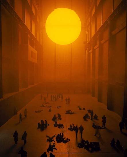
Olafur Eliasson - The Weather Project (2003)


“How are you doing?”

I opened my eyes to see Pete standing above me , packing away his camera.

“Fantastic thanks. “ I said. “You get any good shots?”

“Well I’ve taken tonnes, should have a couple of good ones. Did you see that lot?”

He pointed towards a group of teenagers who were lying flat on their backs in a circle, legs splayed and feet touching. They cheered at the star they’d created on the mirrored sky above them.

Around us children ran in circles, squealing with joy as their parents sat quietly smiling and watching their offspring’s delighted confusion. Club goers, commuters, tourists and Southwark locals sat in groups chatting quietly in the intense yellow light or stood gazing through the mist at the vast disc of light that seemed to hover above us.

Olafur Eliasson’s installation The Weather Project had really caught the public’s attention and imagination, over the weeks that followed it’s unveiling, friends who worked in the area talked of lunchtime trips to Tate Modern during the week ‘to get a bit of sun’ It was a work that somehow created a community of its own around itself by creating an odd little bubble of unreality in which encounters could take place. As vast and technically breathtaking (as an example of electrics and engineering) as it was, it transformed and dominated the Turbine Hall not by occupying and subordinating it – as Anish Kapoor’s Marsyas had a year previously, but by changing the nature and environmental qualities of the space.

Using as familiar a subject as a sunset, I think, also explained the works popularity. It’s a subject we’re all familiar with from holiday snaps and children’s TV art programmes (I seem to remember that the late great Tony Hart would teach us how to make at least one sunset per series of Take Hart.) In the real world it something we’ve all experienced and it appeals to something primal inside us; the end of the day, the dying of the Sun God, the sublime – however you want to frame it. As a retreat from the grey, damp and dismal London weather, it felt like a grand Romantic gesture – a technological updating of works like Frederic Edwin Church’s Cotapaxi that had hung in Tate Britain a few months earlier as part of a show celebrating 19th Century American landscape painters.

But for all the play and fun it brought out in the visitors, there was a perhaps a more Apocalyptic aspect to the work. The monotone lamps obliterating every colour in the room apart from the all pervading sickly yellow gave the space a distinctly alien feel, for all its technical wizardry it felt old and dying, a natural phenomena taken from somewhere else and frozen in a gallery as a museum piece. To my mind, drenched in science fiction as well as art history, I couldn’t help thinking of the 1972 film Silent Running, where the last remaining plant specimens of a dying earth are jettisoned into space. Viewed in the context of Climate Change could The Weather Project be a glimpse into a future where the only place we could experience a sunset would be in a museum, or maybe a society where the only weather we would have would be artifical? I imagined that the people around me would soon leave to walk down gleaming white corridors of a 2001 style space station or some colony base on an inhospitable world to sterile living quarters where they’d dine on protein pills and filtered water. To my mind the work now seemed like a meeting between John Martin and J.G.Ballard.

Perhaps I was being too pessimistic, perhaps if anything The Weather Project suggested that humans will always respond to natural beauty and that we’ll always find a way to take it with us whether it’s a photograph or a vast installation. Perhaps my imaginary future folk had created this as a reminder of home, not as a memorial to it.

“Hello. Planet Earth calling.”

I shook myself out of my geeky reverie.

“Sorry – miles away.”

“Come on, lets go.”

We wrapped our coats tight around us and walked out into the driving autumn rain on the darkening South Bank.

“Of course” said Pete “It could have done with some robots..”

Monday, 7 December 2009

100days of Art: Day Five - More Valuable than a Golden Hare


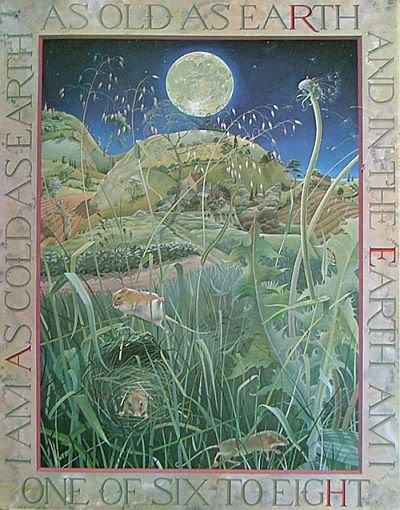
Kit Williams - One of Six To Eight (from Masquerade (1979))

When I started this 100days lark, I sat down at the kitchen table and made a list of artists. The first 70 or so were easy, names of Old Masters, great Modernists and more recent media friendly conceptualists and Turner Prize nominees sped from my pen. The last thirty required a bit more thought, retreating over my list searching for obvious omissions and names already written that would spark connections to other artists I’d missed. I had, for example written Max Ernst fairly early on in the list, but had forgotten his one-time paramour and fellow Surrealist painter Leonora Carrington, similarly I’d listed Man Ray but somehow forgotten Lee Miller (and I can already hear Pete loudly berating me for this omission when he reads this on his return from work – Lee’s his one and only ‘Diva’) By this game of ‘artist association’ this list was soon full, now all that remained was the tricky bit of writing about them.

On Saturday morning though, as we were girding our loins and fortifying ourselves with caffeine and nicotine in advance of a quest into the great outdoors to hunt a Christmas Tree, we watched a BBC4 documentary – The Man Behind The Masquerade. Suddenly I realised that I’d managed to miss an artist off the list who meant so much to me, an artist who had probably influenced me more than any other.

There’s a snobbery about ‘illustrators’ as opposed to ‘artists’. While ‘artists’ make challenging works that question the world and its institutions, ‘illustrators’ merely make visual aids for storytelling. Yet it’s the work of illustrators like Shepard and Teniel, Sendak and Pienkowski who define our first encounters with images and whose work fires our childhood imaginations. These images teach us to look before we can read, without us even noticing, they change our worlds as much as any ‘Great Art’ can. To put them in a 'lesser' category because we experience them on pages in our own home rather than the walls of the hallowed spaces of the public gallery or the warehouses and lofts of Hoxton seems to me to completely underestimate the influence they have on our visual education.

Kit Williams’ Masquerade, published in 1979 told the story of Jack Hare, charged by the sun to deliver a lover’s gift of a fabulous jewel to the moon, somewhere along the journey the jewel is lost and the reader was invited to search the 15 paintings in the book for clues to its whereabouts, the artist having buried a non-fictional jewel somewhere in the UK.

Looking at the paintings again now, thirty years later, the art historian bits of my brain go into overdrive, noting that they seem to represent a kind of eccentrically English and pastoral Surrealism. The strange dreamlike collections of junk shop ephemera – seashells, puppets, cake stands and magnifying glasses – that appear in some of the paintings remind me of the works of Edward Wadsworth. The figures of pale boys, willowy girls and rosy cheeked, bulbous-nosed old men and their awkward poses seem descended from the figures in Stanley Spencer’s views of Biblical tales played out in the cobbled streets of Cookham. Going back further in time, I can’t help comparing the precise and detailed representations of flora and fauna to the flowers that dot every bit of spare space in Botticelli’s Primavera or to the nature studies of Albrecht Durer (his famous hare of course).

From technical point of view they’re brilliant paintings, sadly I’ve never seen any of Kit’s work face-to-face, but even in reproduction they glow with life and dazzle with detail, the translucent-skinned, contorted figures are forced, bursting by strange perspectives from the surface of the canvas, sometimes overlapped by and sometimes overlapping the trompe-l’oiel frames lettered with their cryptic riddles and hidden acrostics.

Yet on the BBC documentary, an art critic from the Times, cast doubt on whether or not Williams’s work could be considered 'Art'. She suggested that art should be new and different and that it should “reflect and talk about its time” and to her mind Williams work achieved neither. I’m always suspicious of those who say “Art should be this or that” as to me it seems to be imposing limits on something that by its nature should be a realm of infinite possibilities. But that prejudice aside, it seemed to me that she inhabits a completely different world to Williams. The private viewings and fashionable opening nights of Cork Street, Bankside and Shoreditch are a long way from the rural Gloucestershire circle of neighbours, collectors, admirers, and models (often the same people) to which Williams exiled himself 30 years ago, stung by the unwanted media attention that Masquerade attracted. But distance and difference do not make a world any less part of its time. Just because artwork speaks of and to a different world it does not follow that it does not speak at all.

Williams’s exile was used by the critic as further evidence of doubt as to the ‘Art’ status of his paintings. It was evidence, she suggested of a ‘lack of balls’, a failing that no true artists should have, as they dutifully hold up their works to scrutiny by critics such as herself. To me this seems again to be mistaking ‘my world’ for ‘the whole world’ and it seemed like a circular argument; ‘Art is only Art if I get the chance to judge it as Art’. A kind of self-justifying corruption of a Zen motto “If someone paints a painting in a forest and there’s no-one there to see it is it still a painting?”

Perhaps I’m being a little unfair to her, it is perhaps a critic's job to make such dogmatic pronouncements, it’s how they make names for themselves and has been since people have been writing about art, but still I was pleased when Turner Prize winner Keith Tyson, and the V&A curator Stephen Calloway (who has the greatest facial hair in the art world) spoke of the work, its craftsmanship and eccentricity with passion, and warmth. I expect the opinions of people who make art and who devote their lives to caring for it mean so much more to Kit than those who fill column inches attempting to define what it should be.

Of course none of the above mattered to the mind of the ten year old treasure hunter who dragged his father out on wet weekends to find the oak tree covered with dog roses on the Hogsback in Surrey where the golden hare was definitely hidden. (It wasn’t, my solution was wrong by about 60 miles*) but it started me looking at paintings in a different way, I stopped just ‘seeing’ them and started really ‘looking’ at them, decoding their secret messages searching for hidden meanings. The Masquerade paintings changed the way I thought about images and started my love affair with art in all its forms.

I may not have found the Golden Hare, but Masquerade gave me something far more valuable. Thanks Kit, I wouldn’t be who I am without your paintings.

(*If you want to know what the right solution was look here)

Friday, 4 December 2009

100days of Art:Day Four - Sometimes a Lance is Just a Lance (but in this case it probably isn't)


Sandro Botticelli - Venus and Mars (c.1483)

Frank Zappa once posed the question ‘Does humour belong in music?” Given that the album in question contained the song Penguin in Bondage, it’s pretty clear that in the mind of the late lamented pointy-bearded musical loon/genius and Czech cultural attaché the answer was a resounding ‘yes’.

Although music was Frank’s target, the question can and should be applied across the arts and that great big ‘yes’ goes across the board, the canon of ‘great paintings’ included.

For example I find Ingres’s Angelica Saved by Ruggerio absolutely hilarious, largely due to the expression on Angelica’s face which seems to have fallen backward through time from a Beryl Cook painting, I can never decide whether she’s thinking “About time too.”, “Oh no not you again.” or “Watch what you’re doing with that bloody lance.” The great thing is that the more detailed analysis you apply the funnier it gets – I once spent a joyful half hour in front of it with a well-respected lecturer in Art History and Gender Studies whose psychoanalytic interpretation had tears of laughter streaming down my face and brought gasps of shock from a coach party from the Batley Guild of Disapproving Women who were tutting around us like a flock of tweed starlings. ( I wont go into the details but the shape of the rock that Angelica’s chained to had a starring role.)

So, if art is so funny, why do galleries echo with hushed whispers rather than gales of bawdy laughter? Simply because it’s the way the gallery space encourages us to behave. Carefully spaced and meticulously lit, hanging in neat rows or arranged on plinths, painting and sculptures are presented to us as sacrosanct objects and we respond in quiet reverence.

This is all well and good, I like a nice empty gallery, I like being able to sit quietly and lose myself in a work of art cloistered away from the noise of the city. (Anyone who’s been in a gallery with me will have noticed me grinding my teeth if someone’s mobile phone starts to ring).

But displaying work in this way also has the effect of separating the work from the life it once had. It’s true that much of the work we see in, say, the National Gallery was once displayed in chapels and churches, even if lit by candlelight rather than halogen, but just as much was hung in sitting rooms, theatres, public offices, clubs, bedrooms and all manner of improbable locations. In their original settings these paintings and sculptures would have been surrounded by political arguments, bawdy singing, declarations of love and lust, drunken fights and laughter.

Take Sandro Bottticelli’s Venus and Mars. Hanging in its white-walled cell in the Sainsbury Wing of the National it seems like a contemplative illustration of a scene from classical mythology – a post-coital moment in the tempestuous and illicit affair between the gods of love and war. (At the time Venus was married to her sort-of uncle/brother Vulcan – classical mythology is more preposterous and convoluted than any soap opera, if you ever have the inclination read The Iliad, it’s like Dynasty on crack with togas). Venus gazes towards her sleeping lover with a cool look, resigned and a touch disdainful at his lack of stamina. A gang of attendant satyrs play exuberantly with Mars’s weapons and armour, one blowing a conch-trumpet in his ear in a futile attempt to raise him for another round of lovemaking.

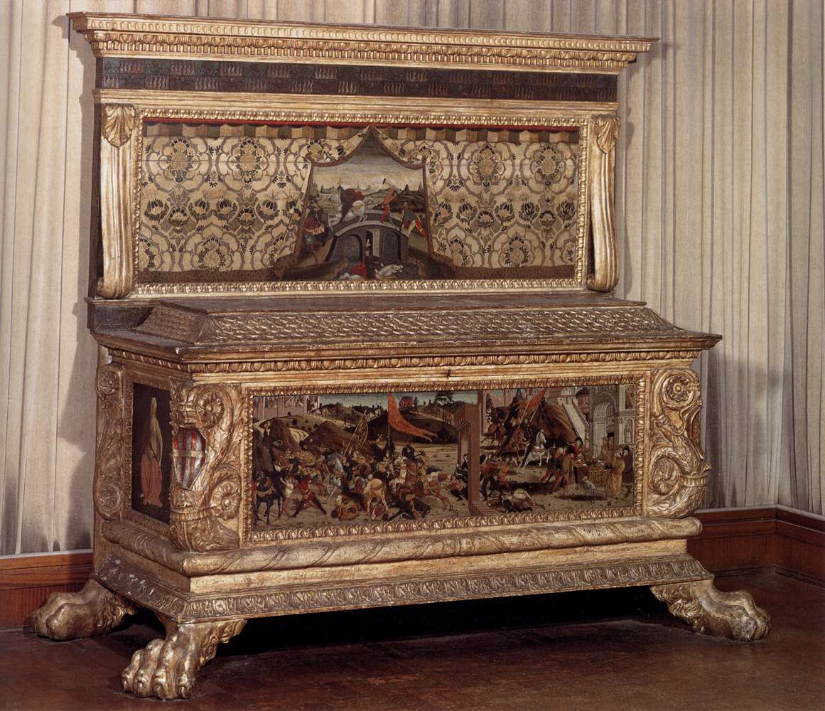
On the face of it it’s a nice simple allegory. Love conquers war. But when we realise what the painting actually was it becomes so much more. Although there are no surviving documents about the painting’s commission, the size and subject matter point to it either being part of a painted bed-head or the front of a cassone – a richly decorated ‘wedding chest’ that would be given to newly married couples to furnish their bedroom as part of the bride’s dowry. The presence of the wasps buzzing around Mars’s head suggest that this may well have been a commission for the Vespucci family – close financial and political allies of the Medici family who held Florence in the grip of their influence at the time.

Marriage in Florence was an incredibly political business, cementing diplomatic allegiances and business deals, and these noble families, jostling for control of trade and influence, frequently used the commissioning of both religious and secular art as means of displaying their power. It’s not too much of a stretch to read a political message into Venus and Mars, to me there’s a suggestion that the power in the relationship lies firmly with Venus, and by implication the brides family – the wasps serving as a reminder to the groom that even when he’s asleep, they’ll be there, hovering close by, ready to deliver a sting should he step out of line.

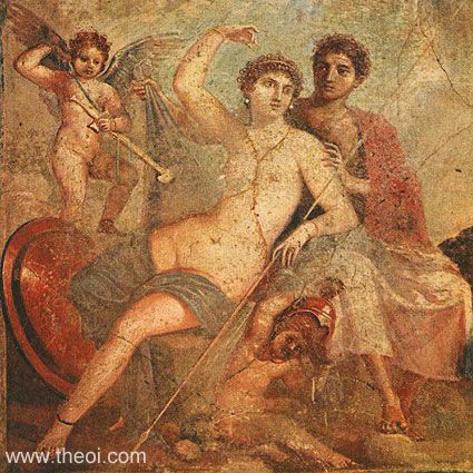
So much for the political message, but I think there’s a sexual message here too. Earlier and later works on the same theme (such as Poussin’s and a mural from Pompeii) show Cupid and cherubs playing with Mars’s weapons of war, symbols of profane, possibly illicit, but still human love. Botticelli on the other hand uses satyrs, traditionally representing boisterous and bestial untamed lust, two waving the lance around with gleeful abandon while another sneaks underneath him reaching for his sword. Sometimes Freudian analysis can be all too easily applied and while I certainly subscribe to the view that sometimes a lance is just a lance, I can’t help thinking that in this instance it probably isn’t.

Take this painting off the wall of the National Gallery and stick in the bedroom of a newly wed couple and the high-minded noble message of ‘Love conquers all’ gets a nudge nudge wink wink coda.

‘Love Conquers all (but sex never shuts up).”

It’s a beautifully painted, graceful, elegant and erotic incitement to pleasure, a seaside postcard of a painting with a subtle political sting in its tail. Go and stand in front of it and laugh – I’m sure the people it was painted for did.

(Tomorrow - back to the 21st Century and sunbathing.)

Thursday, 3 December 2009

100days of Art:Day Three - Shock and Horror!


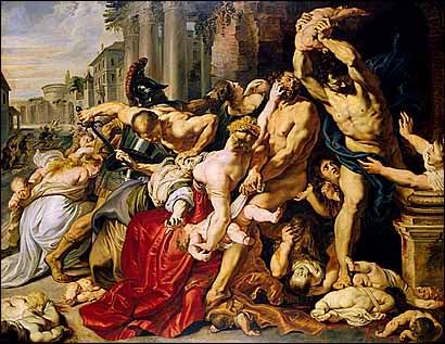
Peter Paul Rubens - The Massacre of the Innocents (c.1611-12)


Shock horror! It’s a painting. A painting of people. Painted to look like people rather than collections of squares.

The first two days of this blog might have given you the impression that realistic paintings and sculptures were not my thing, but that couldn’t be further from the truth. I get as excited and animated about Duccio, Mantegna and Manet as I do about Mondrian, Duchamp and Emin. I’m an equal opportunities art geek.

But like most geeks I specialise. When you’ve got 32,000 odd years of art history to play with (arbitrarily calling the Chauvet cave paintings 'the beginning'), you've got to be a bit selective otherwise your head would explode - the bits of my brain that deal with where my keys are or what day it is are already compromised by being filled with odd facts about Cubism. As a consequence there are great big holes in my knowledge of art history, defined in part by the curricula I studied but probably more by my own personal tastes and enthusiasms.

One of these gaping chasms is labelled 17th Century Flemish Painting, and this is largely a result of personal prejudice. With a few exceptions I’ve never found it easy on the eye; the figures have always seemed inelegant to me – doughy lumpy great hunks of flesh arranged in twisted, tortuous poses staring watery-eyed from gloomy brown rooms, a million miles away from the gracefully arranged waifish and androgynous soldiers, saints and satyrs that populate the Italian Gothic and Renaissance paintings that make me go weak at the knees.

So when Nick suggested that I write a blog about Peter Paul Rubens’s The Massacre of the Innocents, he really couldn’t have chosen a weaker spot if he tried. But if this Hundred Days project is about self improvement then he’s done me a favour by forcing me kicking and screaming out of my comfort zone. In the past twenty four hours my knowledge of Rubens has increased from, well, bugger all, to quite a bit more than bugger-all. Result.

So now, having already spent nearly three hundred words avoiding writing about the painting, where do I start?

Well, ‘horrific’ is as good as place as any I suppose. Giotto or Breughel’s paintings of the Biblical story of Herod’s paranoid slaughter of the children of Bethlehem are the type of imagery that Pope Gregory had in mind when he defended the making of religious paintings as “The Bible for the illiterate”, they act as visual shorthand, merely illustrating the key points of the story. Rubens on the other hand goes all out to provoke a emotional response from the viewer, to involve us in the atrocity in front of us. He does this by forcing us on a journey through the painting..(and here you’ll have to excuse me as I deviate from my usual approach of anecdotes and whimsy into the slightly more dry and dusty area of formal analysis).

Take a look at the composition – where does your eye settle when you first look at the painting?

Mine heads straight to the great red splodge of drapery in the centre, then up to the top right hand corner, to the baby being violently swiped through the air by the inexplicably nude Roman soldier. Everything in the painting directs our attention to that point – the great mass of limbs that make up the confusing group of figures in the foreground tangle around a diagonal line that cuts through the painting. The leg of the armoured Roman soldier at the back and the arms of the woman in the red skirt form two sides of a triangle sitting on this diagonal like a great bloody arrowhead directing our eye upwards. The fact that the Roman soldier on the left is the only figure not jumbled up in the rest of the chaotic blur of flesh also pulls our eyes to that side of the canvas as does the sharp contrast of the figure against the dark patch of background that occupies the right side of the painting – a formal technique known as chiaroscuro that Rubens learnt from the works of Caravaggio while studying in Italy.

Even if we didn’t know the title of the painting and the story which it shows, we already know that something is desperately wrong here, but in case we’re in any doubt, Rubens pulls another formal trick out of the bag to make sure we grasp the full horror. Now our eye is led downwards along the blue sash that curls around the soldier’s torso, sketching the trajectory of the child’s body through the air, past the outstretched hands of the woman to the right, ending in a shattering collision with a stone plinth where a smear of blood leads us to a pile of already greying corpses of previous victims.

Now our eye recoils to the left and for the first time we notice the arms and legs of other dead children poking out from underneath the skirts of their mothers in the main group of figures and then back to that great big lake of crimson drapery now standing in for a vast pool of blood whose depiction would have been a step too far even for the 17th century commissioners of religious painting for whom the visceral was meat and drink.

I've only scratched the surface of course. There's a lot else I could talk about, like the fact that many of the figures were based on the sketches Rubens made of Classical and Rennaisance sculptures during his Italian journeys, that until 2001 the painting was thought to be by Jan van der Hoeke, one of Rubens's workshop apprentices, or that after its reattributation it was one of the most expensive Old Master paintings sold at auction (a whopping 45.9 million quid), but this is a blog, not an academic paper. Hopefully my little guided tour of the painting is enough to show that it’s a technically brilliant, grimly effective and troubling piece of Baroque, as grotesque and shocking as anything that the Chapman Brothers have produced and a long way from the popular view of Rubens as a painter of rosy cheeked, statuesque and jolly nudes. It’s certainly changed my view of an artist about whom I knew very little and as an exercise it stirred a few grey cells that have lain dormant since the last time I sat an exam and it's inspired me to want to find out more about the artist and the painting.

So thanks Nick for forcing me out of my comfort zone, (and thanks to my fellow Hundred-Dayers Daniel and Erika for their tweets of support today).

(Tomorrow I’m going to retreat well and truly back to my comfort zone and away from all this blood and guts to an Italian painting that never fails to make me chuckle.)

Tuesday, 1 December 2009

100days of Art:Day Two: The Joy Of Bricks

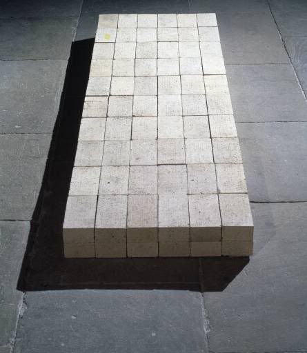
Carl Andre - Equivalent VII (1966)

When I was eight, my mum took me to the National Gallery, stood me in front of Paolo Ucello’s Battle of San Romano and asked me what I thought. Apparently I stood there for a second before announcing that it looked like painting by numbers. The memory is long lost to me now, but I can imagine the stifled sniggers of other gallery goers and my mum’s embarrassment at having raised a mini-philistine (to be fair to her ,in reality, she probably sniggered too.)

Of course these days when I look at the painting, I’m thinking of far higher things – of the techniques and commissioning practices of Medieval Tuscan panel painting, of the politics of 15th century Florence and Siena, of all ranges of viewing positions and theoretical mumbo jumbo, and yet right at the back of my head somewhere, nagging away is the voice of an eight year old boy saying “painting-by-numbers”

The things is though, now when I look at it I can see what I meant, there’s a consistency and precision to the great big flat patches of colour that make up the figures and landscape that do almost suggest to the facetious and fanciful part of my mind that Ucello and his workshop apprentices were slaving away matching paint to numbers:

“Oi! Paolo – what colour’s number 7?”

“Ultramarine Giorgio – and make sure you stay inside the lines”.

With hindsight I don’t think my eight year old self was denigrating the painting, in fact I think it was a compliment, I knew how hard it was to stay inside the lines. (Come to think of it I still do, as the sometimes wobbly outlining in my own work will attest.)

Years later when I was beginning my studies of art history, and was crowing at the high grade that my first essay had achieved, Mum sent me a postcard of that painting with the story of my first attempt at art criticism written on the back. I think the maternal intention here was twofold – first to remind me never to get too big for my boots, and second, and more relevant to today’s little artblurt, to remind me not to forget one of my first encounters with a work of art.

So what’s all this got to do with a pile of bricks – or more specifically Carl Andre’s Equivalent VIII? Stay with me – all will become clear…

There are some pieces of work which I wish I could somehow induce a state of temporary amnesia about so I could relive the innocence and excitement of that first encounter, especially those encounters that occurred when I was a child One of those works is Carl Andre's Equivalent VIII (more commonly known as 'the pile of bricks').

Andre was one of a loose group of artists, writers and curators that emerged in the USA in the 1960s, who have come to be classed together by art historians as the Minimalists. The art was simple, but to make up for it the theory wasn’t – a lengthy and heated correspondence was entered into, battle lines were formed and a debate raged back and forth in the pages of high minded art journals. Now I love the game of Minimalist art theory – it’s the kind of navel gazing mental gymnastics I was talking about yesterday. A few years back I was at a session on Minimalism at a summer school and the tutor was asking us all to talk about a particular work to show how much we knew. When it came to my turn I was asked to talk about Equivalent VIII and I was overjoyed. I babbled garrulously about form and function, about objects and phenomenology, about modernism and postmodernism until, when I finally stopped to draw breath, the tutor said “Good grief Howard, if you can talk so much about so very little you’re already an art historian”.

This was all very well and good, and I got a kick out of the gold star from teacher – even if it was a fairly double-edged compliment. But something nagged at me, I remembered loving Minimalism from a quite early age before I knew any of that theory or history and no amount of Artforum articles could explain what it was that attracted me to that kind of work in the first place. I wrestled with this problem for a while – this is the kind of thing that keeps me awake at night, well that and a few other odd little things (Chaos theory, why my aubergines have stopped growing, the next episode of Doctor Who) that prompt Pete to say “For God’s sake stop it – I can hear you thinking. Some of us need to get some sleep.”

Then one day I hit on the solution – to head to the Minimalism room at the Tate Modern on a Saturday afternoon and watch children react to the art.

It wasn’t particularly busy in the gallery that day, but I stationed myself near the bricks and waited. Soon a boy, of about a similar age to me in front of the Ucello all those years previously walked in accompanied by a frazzled and cynical looking Dad. The boy made a beeline for the bricks and studied them with the intense seriousness that only and eight year old can muster.

“See Toby,” huffed the dad “Told you there was a load of old rubbish in here – look at that. A pile of bricks!”(Okay I’m not sure if the boy was called Toby, but it just fits)

I like that.” said Toby seriously.

“Don’t be daft” replied dad “You could have done that.”

“And that’s why I like it.”

Game, set and match Toby.

Exit wannabe art historian stage left stifling giggles.

It’s a cute anecdote, but the point is this - Toby got it! Without recourse to piles of textbooks, without hours spent in seminars, without a working knowledge of the ideological debates around art in the sixties, this eight year old had instinctively recognised something so central to Carl Andre’s project ‘art that anyone could make’.

Art is a wonderful thing and of course a head full of knowledge and experience can make us appreciate it all the more, but sometimes we just need to chuck the books out of the window and look at work like we did when we were children, sometimes our childlike instincts can prove to be just as insightful as our jaded adult eyes and minds.

It’s me being fanciful again, but I’d love to think that in a couple of decades time somewhere a yawning art history student will turn over a postcard of a pile of bricks to read..”Do you remember when you were eight and I took you to Tate Modern…”


(Note: Tomorrow I'm going to be writing about Rubens's The Massacre of The Innocents at the suggestion of my dear friend Nick Kirby - if anyone else has any ideas for artworks that they'd like me to compose an unfocussed ramble on, please feel free to comment below or drop me a tweet.)