Well, I'm shortly to start blogging again, and just for a bit of a change of scenery have moved over to Wordpress.
Come and find me here
Sunday, 17 October 2010
Monday, 21 December 2009
100days of Art: Day Fourteen: Pearls

Well and truly in the festive spirit today, so I thought I’d give you a present. It’s not an artwork you can see or touch, but it’s an artwork that you can enjoy anywhere at any time and once you’ve got it, you’ve got it forever. You can even give it to someone else without losing it.
Lawrence Weiner was one of the first wave of Conceptual Artists who emerged in the late 1960s and early 70s, who, in the words of the critic Lucy Lippard “dematerialised the art object”. The idea behind art became paramount and the actual physical nature of it was deemed to be unimportant. Artists produced performances that were documented in photographs, issued statements and theoretical texts and made work from sound or light. On the occasions where there was a physical presence it was usually made form the most abject or mundane materials – sand, condensation, rubbish, food and air.
Weiner’s work takes the form of statements of ideas for artworks, whether or not the owner or the curator decides to carry out the instruction is unimportant – more often than not, they chose merely to exhibit the statement itself. A River Spanned (1969), for example is usually displayed as a small card with those works written on it, a bridge could be built or a line could be fired from one bank to the other, but in a way to actually carry out the instruction would limit the work – as a simple statement it’s full of possibility and dependent on the viewer, open to an almost infinite number of possible interpretations. It could be any river, the spanning could be achieved in many ways, the end result is a collaboration – the artist provides the idea and our imaginations fill in the gaps.
Some of Weiner’s work is more prescriptive such as One Aerosol Can of Enamel Sprayed to Conclusion Directly upon the Floor (1968). Although more specific than ‘A River spanned’ there is still much room for our imaginations to shape what final form the completed work might take, we might think of the sounds and smells that such an action would produce., we might think of the effect that different angles of holding the can might have, is the paint to be sprayed in one spot producing a pool of paint or are we going to coat the entire floor? What colour is the paint? What does the floor in question look like and what will the effect of the surface be on the end result? A simple instruction detailing a simple action draws attention to the complexity of the world in which that action might take place.
In theory I’ve now already given you two artworks (I’m a generous soul) but the one I really wanted to give you is one that has always stuck in my mind since I first saw it.
“Pearls Rolled Across A Floor”
I can hear the sound they'd make, I can see the pearls and the floor (in my mind it's dusty and wooden), I can imagine their different textures of the wood and pearls, I can even smell the wood and imagine the space that the situation might be taking place in, I can even imagine events that might lead up to this situation. It’s full of poetry and possibilities.
I hope you enjoy it as much as I do, help yourself to the others as well, and feel free to pass them on.
Happy Christmas.
Friday, 18 December 2009
100days of Art: Day Thirteen - A Lot of 'Not Much'

Richard Serra - Trip Hammer (1988)
It may sound like a contradiction in terms, but some Minimalist art is big, really big. It almost as if the artists want to emphasise that there’s not much there by making an awful lot of ‘not much’. Donald Judd’s series of free standing boxes for example are big enough for a few close friends to climb into, Robert Morris, Carl Andre and Tony Smith all made works that left little room for viewers in the gallery, but perhaps the master of minimalist overstatement is Richard Serra.
I’ve alluded in past blogs to the brain-scrambling theoretical debate about the nature of art that raged in the journals of the mid 1960s. It really is too arcane to go into in any great depth here but to simplify one of the central platforms of the minimalist project addressed the issue of Art’s relation to the real world. On one side were the critics and theorists who had supported the first wave of American Abstract Expressionists. Art should, they said, be an end in itself, it should have nothing to do with the real world, the ideal art was concerned only with itself, with colour and form. Such an approach, it was argued, made art a specialised sphere of activity and one that could lift the viewer into a timeless state of being away from the mundane concerns of the world.
Predictably such a dogmatic approach didn’t sit well with the stirrings of political unrest and burgeoning counter-culture of the 1960s, and soon opponents of this isolationist approach argued exactly the opposite, that art should anchor the viewer in their place and time, that it should make people aware of the world, not create a hermetic bubble into which they should escape. A new art was required, one which, in Claes Oldenburg’s words “does something other than sit on its ass in a museum”. A new wave of artists and approaches emerged that brought real life back into the gallery in the form of stuffed goats, comic book art and installations while performances and ‘happenings’ were staged and collaborative sculptures were built as part of protests taking art out into the real world.
For the Minimalists a key aspect of bringing the real world into the gallery involved a conscious rejection of the traditional materials and methods of art. Paint, bronze and marble were replaced by plastic, concrete, steel and aluminium, many of these materials being made, not by the artists themselves, but by industrial manufacturers working to the artists specifications. The artists studio was no longer an ivory tower of contemplation but a noisy factory full of dirt, steam and sparks.
Richard Serra could arguably be seen as the most ‘industrial’ of the Miminalists. From his early work that involved splashing the walls, floors and corners of the gallery with molten lead he progressed to installing increasingly large sheets, slabs and tubes of COR-TEN Steel that were held in place only by their weight and the effects of gravity and balance. As well as being unashamedly industrial, this choice of material connected with the rejection of a ‘timeless’ experience of art by being specifically designed to corrode over time, thus the physical nature of the work itself would change while it was displayed.
The viewers’ experience of the work was also intended to unfold over time, the simple shapes allowing them to comprehend the object in front of them as they walked around it, the absence of such unnecessary complications as intricate shapes or different colours allowing the viewer to explore the relationship between the space the work and themselves. It’s a difficult theoretical argument to get across without lapsing into the kind of talk that graces Private Eye’s Pseud’s Corner, but Serra’s work is, I think, the clearest illustration of this particular aspect of the debate.
Encountering Serra’s Trip Hammer is an unnerving experience. Two great slabs of rusting steel are arranged with no visible means of support in the corner of the gallery, one nine foot high monolith is balanced vertically on it’s smallest edge leading into the corner of the space, the second, slightly smaller slab balanced on top horizontally, its longest edges at 45 degree angles to the converging gallery walls. The familiarity of the material and simplicity of the precarious arrangement gives you a a very real understanding of the hard physical facts of the sculpture, its texture, temperature and most importantly its weight. You can easily imagine the whole thing toppling over and crashing through the wooden floors. Even if it wasn’t for the Health and Safety precautions of a gallery rope that now surrounds the work you really wouldn’t want to get too close. You do become acutely aware of the realities of your physical self in relation to the looming rusted metal in front of you.
Serra’s work has been criticised for it’s authoritarianism, its machismo and for creating a relationship between art and viewer akin to that between a ‘bully and victim’ and given that in 1988 two art handlers were seriously injured by a falling sculpture the ‘victim’ status of people encountering the work can sometimes be applied literally.
Of course there is something unashamedly macho about a form of art that requires foundries and heavy machinery rather than brushes and white gloves to create and install, and yes there is something authoritarian about an art that dominates a space and threatens to crush the viewer like an ant, but I think it needed to be. A seemingly impenetrable barrier had been set up between art and life and the strategies necessary to bring that barrier crashing down weren’t polite, weren’t tasteful and they weren’t quiet, they were noisy, tacky, flashy, flamboyant, exciting, frightening, dirty, rough, big and on occasions dangerous.
Just like life really.
Thursday, 17 December 2009
100days of Art: Day Twelve: What's The Story?
 Edward Hopper - Automat (1927)
It's the ‘story’ bit of art history that really fires me up. Happily works of art are surrounded by stories. Stories of how they were made, of who made them, of who has owned them…I could go on (it would be a nice easy way of hitting my word count for the day), but the point is that art is like an anchor for a whole web of stories that spread out from it backwards and forwards in time, sometimes parallel, sometimes crossing over and sometimes directly contradicting each other.
Sometimes this web of stories can become so dense and knotted that it’s almost impossible to see through it. Over the years many friends have made the trip to Paris to see the Mona Lisa and their reaction invariably contains the words ‘disappointing’, ‘small’ and ‘brown’. I think the problem is that Leonardo’s painting is just too well known, it has so many stories floating around it, it’s weighed down with myths and legends, it’s been parodied and reproduced, it’s made cameo appearances in films and television series (any Doctor Who fan will be unable to look at it without imagining ‘This Is A Fake’ written on the back of it in Tom Baker’s handwriting) and it’s been printed on T-shirts, mouse mats and shopping bags, in fact, if you can stamp an image on it, the chances are that La Giaconda’s been on it at some point. Because of this fog of stories and ideas that gather around the painting our expectations of it are so high that even if it was a hundred metres tall and made of platinum we’d still find the experience of a face-to-face encounter sadly anticlimactic.
But it’s also the absence of a story that can fascinate us and draw us in, Brozino’s Allegory, intrigues precisely because although the story has been lost it so clearly dripping with narrative intent that we have to fill in the blanks.
This natural reaction to fill in the blanks has been used by modern and contemporary artist to great effect – the installations of Mike Nelson and Ilya Kabakov both play with narrative instinct, offering us enough clues to know there’s a story there, but not enough for us to be absolutely certain of the strange characters that once inhabited their strange ghostly spaces and stage sets or the encounters that took place there and it’s then that our own stories, our memories and experiences, come into play, meshing and tangling with the artwork’s as we try to make sense of what’s in front of us.
For me though, the master of the uncertain narrative in art is Edward Hopper. His paintings of modern life in rural and urban America in the first half of the 20th century drip with intrigue. Hopper’s world is one where every figure or building has a secret and where every gas station lies on a road that could lead to adventure or disaster. He gives us enough tantalising detail to draw us in, setting up situations like the first chapter of a book or first scene of a film and letting us run with it wherever our minds take us.
The cinematic quality of Hopper’s work is almost a cliché now but it bears repeating, so strong and familiar is his use of the visual grammar of starkly lit and almost deserted urban spaces that we associate with film noir that it’s the first thing that strikes us when we see his work. It should be noted however that the relationship between Hoppers work and the look of Hollywood films isn’t a one-way street. Hopper influenced as much as he was influenced – Alfred Hitchcock for example used Hopper’s 1925 painting House by the Railroad as the basis for the design of the Bate’s Motel in Psycho, and his paintings continue to make their presence felt in the world of cinema – Terence Malik, Ridley Scott and Sam Mendes have all acknowledged the debt they owe to Hopper.
Automat sets up one of these ‘first scenes’ brilliantly. It’s night, a girl sits alone in an automated fast food restaurant. She’s removed one of her gloves. Outside the street may or may not be deserted, we can’t tell since the reflection of the sterile and brightly lit interior has obliterated our view of the outside world. It’s difficult to tell whether her blank gaze rests on the table in front of her or the empty chair opposite. The restaurant itself seems deserted, and here the title of the work comes into play, by making it clear this is an automat, we know that there are no waiting staff present merely morgue-like rows of mass produced food in glass-fronted, coin-operated pigeonholes. Her only company seems to be the bowl of fruit that sits on the windowsill behind her.
This last detail reminds me of Manet’s Bar at the Folies Bergere – is there an implication that the girl, like Manet’s barmaid, is as much a commodity on display as the fruit bowl? Unlike Manet’s painting however, Hopper leaves us, the viewer, out of the equation, at the Folie begere, we’re clearly meant to identify with the top-hatted dandy we can see in the reflection to the left, but here in the Automat we seem to be absent rather than present – we have no reflection and the girl does not acknowledge us – we’re a ghost, a voyeur, like a film goer we can only watch, we can’t interact.
So what’s the story?
The great thing about Hopper’s work is that the gaps he leaves in the narratives are so flexible that no two people are likely to come up with the same story. Pete, my mum and I all stood in front of Automat when it was shown as part of Hopper’s retrospective at Tate Modern in 2003, and all of us came up with different stories – for me (morose as ever) the girl had been stood up by a blind date, for Pete she was a spy waiting for another agent to arrive so she could hand over the microfilm and for mum she was taking a break from a shopping trip, enjoying a moments quiet away from the busy city outside. Of course none of us were right, but none of us were wrong, we brought our own perspectives to the painting and as a result the encounter probably said more about us than it did about the painting.
So after all that what have learnt? I’m a miserable git, my mum’s a shopaholic and Pete’s a spy. Hmmmm. Must look into that. Might explain why he never lets me drive the car – worried I’d set of the ejector seat probably…
Wednesday, 16 December 2009
100days of Art: Day Eleven - And Now For Something Completely Different.
 Bronzino - An Allegory with Venus and Cupid. (c.1545)
Sometimes a piece of information comes your way that irrevocably changes the way you look at a work of art. Take for example Vincent Van Gogh’s Sunflowers; stand behind some gallery visitors admiring it in the National Gallery and you’ll inevitably hear one of two things.
First that Van Gogh was a lunatic who cut off his own ear. People look for clues in the work and usually come the conclusion that you can somehow ‘see’ this madness in the painting; it’s fevered brush strokes and it’s obsessive yellowness seen somehow as a means of diagnosing the mental state of the artist. Of course this is a clumsy connection to draw – if thick impasto brushstrokes were a symptom of mental illness then Frank Auerbach would have been sectioned long ago.
The other thing that is commonly heard in front of the Sunflowers is discussion of the vast price that was paid for the work at auction – even though it was in fact a different version of the painting that set records in 1987.
Both these pieces of information, although not entirely accurate, affect the viewing of the painting by being part of the Van Gogh myth. The myth plays as much a part in the creating the meaning of the painting as do the historical facts of its manufacture.
Sometimes though, these snippets of information can be so far removed and apparently irrelevant to the work yet still change the way you see an artwork forever.
I’d always been intrigued by Bronzino’s An Allegory with Venus and Cupid, amongst all the nudes in the National Gallery, this strange depiction of Venus and Cupid in a lover’s embrace seemed a bawdy and shocking painting and it’s worth considering what headlines might be produced if a contemporary artist created a work depicting a similar subject. Even at the time of it’s acquisition by the National in 1860, Charles Eastlake, the then director of the gallery, took steps to make it ‘safe’ for public viewing by having certain details hidden by the addition of strategically placed branches of myrtle and by deleting, by overpainting, Venus’s tongue, which contemporary viewers can see slipping into her sons mouth. There was even much discussion about how the painting should be titled, An Allegory with Venus and Cupid finally being chosen as a neutral designation that would avoid drawing too much attention to the incestuous scene.
But more than that, what continues to fascinate about Brozino’s canvas is the sheer lack of information that exists about it. All that’s known is that it was commissioned as a gift for King Francis I of France, most probably by Cosimo I de Medici. Beyond that we know practically nothing and consequently the symbolic meaning of the painting and its strange cast of characters is something that art historians will enthusiastically disagree with each other about from now until doomsday.
The haggard, screaming figure to the left of Cupid, for example, has variously been identified as Despair, Jealousy or even in some account a personification of the ravages of syphilis. The female child to Venus’s right, who attempts to hide her scaled and feathered body behind the boy throwing rose petals and offering a dripping honeycomb to the lovers, may be Pleasure or Fraud. Everything in the painting is loaded with symbolism and meaning, the fact that Venus is grabbing one of Cupid’s arrows, the Golden Apple that she holds and the masks of comedy and tragedy that lie abandoned at her feet.
It’s a great puzzle of a painting, and one that more than likely will never be solved. But there’s one piece of information about the painting that has nothing to do with its life in 16th century Florence or France, that has nothing to do with the riddle of its symbolism or the negotiations that Eastlake and his team of restorers went through to avoid its display bring about the moral collapse of Victorian gallery visitors.
When I stand in front of this painting the first thing I notice now is Cupid’s right foot in the bottom left hand corner of the picture, seemingly about to trample on a dove. Take a close look – have you seen that foot before somewhere? Do you find yourself humming the opening bars of Sousa’s Liberty Bell? Perhaps you start thinking of dead parrots and transvestite lumberjacks.
It’s the foot that squishes down in Terry Gilliam’s opening animation sequence for Monty Python’s Flying Circus.
Of course it’s got nothing to do with the meaning of the work in any rigorously academic way, but it does add to my enjoyment of the painting. It’s cheeky little detail in an already cheeky image; a subversive little footnote (sorry) to an already subversive painting and one that goes to show that the story of an artwork doesn’t end once it’s hung in a gallery.
Monday, 14 December 2009
100days of Art: Day Ten - Collapsing the Distance

Edouard Manet - Olympia (1863)
Looking with 21st Century eyes, it’s difficult to believe that the paintings of Eduard Manet once provoked such an outcry. To contemporary eyes Olympia looks hardly radical or provocative; a reclining nude painted in a realistic fashion. The walls of national collections of Western art the world over are crowded with such paintings. Even at the Salon des Refuses in 1865, at which Olympia was exhibited, the female nude was a perfectly acceptable subject and in previous years works like Alexandre Cabanel’s Birth of Venus had been exhibited without an eyebrow being raised.
Yet when Olympia was first exhibited in Paris, the popular press raged and stormed in a way that would make today’s tabloid hysteria over a priapic golfer seem measured by comparison. The painting, and by implication the artist, was, according to the journalists, both incompetent and immoral. The fury was not just limited to writers and critics, the exhibition visitors were also so enraged that the organisers were forced to put guards on the painting to stop it being torn to shreds.
As far as Manet’s incompetence was concerned, the writers drew attention to the apparent slapdash application of paint; great splodgy sweeps of paint appeared to have been smeared onto the canvas. The brush strokes were visible on the surface rather than being disguised by the repetitive and meticulous painting and under-painting of heavily diluted paint that was prescribed by the state-sponsored Art Academies and studios in which all painters learnt their crafts.
The case for ‘immorality’ is slightly more complex. Unlike Cabenel’s Venus, Olympia wasn’t a mythological fantasy, she was a contemporary woman, but not just a contemporary woman. Her shoes, bangle and choker identified her to the critics as a prostitute probably from the Batignolles suburb of Paris – a well known destination for gentleman of the middle classes looking for entertainment. In fact the model was Victorine Meurent a close friend of Manet’s who went on to become a painter herself, but it’s clear that the critics’ interpretation was what Manet had intended. For the establishment of late 19th Century Paris such a woman was not a suitable subject for a large scale work of art, which were normally reserved for noble themes from mythology, history or the Bible.
The offence of the subject matter was compounded by the fact that the clear source for the composition of Olympia was Titian’s Venus of Urbino. The nude was posed in a similar way and the picture space was divided by a screen. Manet’s alterations to the orginal subject piled offence upon offence in the eyes of the critics, the dog that lies curled up at Venus’s feet, representing loyalty, was replaced by black cat, recognized as a symbol of licentiousness, back arched and hackles raised, staring beadily at the viewer. While Venus’s left hand rests, almost beckoning, on her groin, Olympia's is taut, protective and entirely in control.
It is, I think, this assertion of Olympia’s self determination and control of the depicted situation which caused most problems for the critics. The classical and academic nudes that were a staple of the Salon never made direct eye-contact with the viewers, they stared into the middle distance or looked up coyly through their eyelashes offering their bodies as art objects to be admired in a morally uplifting way. Any suggestion that the enjoyment that might be gained by the frock-coated and top-hatted men who attended the Salon and perused the nudes of Cabanel might have been more sexual than spiritual were easily dismissed by appeals to the noble subject matter at hand. But a modern woman, a prostitute at that, staring directly at the viewer with a questioning expression on her face allowed no room for such ethical dodging. It’s entirely possible that the men who expressed their outrage at Olympia may well have been leaving the Salon to attend an assignation with one of the many barmaids or laundresses of Batignolles a comfortable distance from the high society of Paris and their homes. Olympia collapsed that distance.
Manet had painted a modern woman in a modern way. He’d brought real life into the unreal world of the art gallery, showing up the hypocrisy of the great and good of Paris’s fashionable set and ruling classes in the process. He paved the way for the Impressionists who followed hot on his heels and all of those modern artists who came in their wake. It’s perhaps a bit of stretch to call him the father of Modern Art, there are too many other precedents to take into account, but the father of Modern Art as Outrage? I’m prepared to give him that one.
Friday, 11 December 2009
100days of Art: Day Nine - Zips.

Barnett Newman - Onement I (1948)
I’d loved Barnett Newman’s paintings since my adolescence, the simplicity and effrontery of painting a stripe of one colour flanked by another and calling it art appealed to the same bloody-minded bit of teenage rebellion in me that worshipped Joy Division, it was sparse and stripped down, making noise by what was left out rather than what was put in.
I’d studied his paintings in reproduction, but apart from three relatively small canvases in the Tate collection, I’d never seen any of his work in the flesh until a major retrospective at Tate Modern in 2002.
The exhibition was arranged chronologically, as you passed from room to room, you passed through the years of the artist’s work, starting at the beginning and ending at the end. This might seem obvious, but since the sixties other ways of arranging exhibitions, or ‘hangs’, have come into fashion. Sometimes a hang may be arranged by subject or medium it all depends on the story that the curators want to tell. In group shows or retrospectives of art movements, these thematic hangs can set up new and exciting relationships between artworks, it’s something we take for granted, but a good hang can breathe new life in to a work that has almost faded into the background because of its familiarity.
For an abstract artist though I tend to think the chronological hang works best, particularly for those of the first half of the twentieth century for whom abstract art was a matter of stretching the possibilities of painting. Abstract art is now so ubiquitous in homes, boardrooms, shopping malls and restaurants that it’s hard to imagine a time when it simply wasn’t considered a possibility. Viewing these artists’ works in chronological order helps us reconstruct some idea of just how revolutionary their project was.
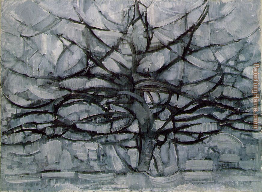
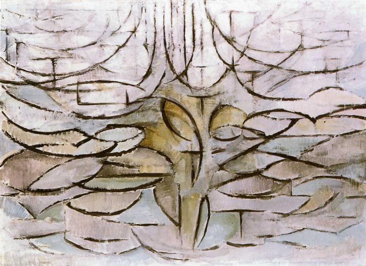
For the European pioneers of Abstract Art there’s an excitement in seeing their works slowly creep towards a complete rejection of images from the real world. For example, viewing Piet Mondrian’s series of paintings of trees from the 1910s (Red Tree, Grey Tree,Tree,Apple Tree) is an exciting experience, you see an artist reaching and grasping for the abstract yet still tied by the conventions and culture of his time to the image of a tree. It’s like watching a piece of elastic being stretched and stretched and stretched, you’re just waiting for that connection between painting and the real world to snap.
For the American abstract painters of the 1940s and 50s, the situation is slightly different, the ‘Abstract Expressionists’ as they’re awkwardly named, all developed a ‘signature style’ that anyone with even a passing interest in Modern Art is familiar with. If we see splashes we know it’s a Pollock, if we see monolithic blurry rectangles we know it’s a Rothko and if we see stripes, or ‘zips’ as he called them, it’s a Newman.
The excitement and tension in an exhibition of these artists is seeing their work creeping towards the discovery of this signature style. The first few rooms of the Newman exhibition were filled with intricate organic doodles that recall the ‘automatic drawing’ experiments of the Surrealist Andre Masson. Occasional zips made cameo appearances, but only as background elements. These were followed by a tantalising series of monochrome works in ink where a series of ‘almost’ zips made their first starring roles – sometimes they didn’t quite make their way all the way down the page, sometimes they were subtly angled, like the blade of a stiletto stabbing its way through a mess of ink. Finally in the third room the first true zip made its appearance, in Onement I, a great untidy streak of orange cut across a loosely painted background of maroon.
It’s hard to get across how exciting I found this experience, even as I write now the rational, cynical part of my mind is saying “It’s just a stripe for God’s sake” but it was like seeing a film all the way through for the first time that you’d only previously seen the last five minutes of. You know the hero will defuse the bomb; you just don’t know how he going to do it and as the story unfolds you’re bouncing up and down in your seat screaming “The disarming code’s tattooed on the dog’s ear!” or in this case “Paint a bloody stripe!”
So are Newman’s zips ’just stripes’. On the face of it does seem rather simple. There’s a story that the artist Franz Kline found himself in conversation with an American collector who had just returned from one of Newman’s shows. The work was, the collector complained, empty and repetitive, there was he asserted ‘nothing to see’. Kline asked him to describe the canvases on show, their dimensions, their colours, whether the zips were horizontal or vertical, what colour they were, were they painting over the background colour or next to them, were they darker or lighter than the backgrounds. After a lengthy inquisition during which the collector was made to detail the many variations on the theme, Kline remarked “Well I don’t know, it all sounds darned complicated to me.”
I think that’s what I love about Newman’s work , it’s the single-minded pursuit of a simple idea and exploring its many variations, taking something as simple as a stripe and pushing it as far as it can go. It has something in common with minimalist music, take Sigur Ros’s Samskeyti which repeats a simple piano arpeggio over and over lulling you into familiarity, slowly introducing and building up different background atmospherics that subtly change the nature of the melody, then when you’re least expecting it, the arpeggio leaps up an octave and it’s a surprising and sublime experience hearing it for the first time. Newman’s painting work like that for me – familiarity with a theme making its variations so surprising.
Anyone can make the simple look complicated, what’s really difficult is making the complicated look simple.
Subscribe to:
Posts (Atom)
